Showing posts with label Infographics. Show all posts

25 September 2018

Are Millennials Interested in Art? Yes, New Park West Gallery Study Finds

by
Millennials almost twice as likely to say they know something about or appreciate art as Baby Boomer generation
Millennials are much more interested in art than previous generations, and social media may be driving their attraction to it, according to a new study conducted by Park West Gallery, one of the world's largest private art galleries.
Millennials are almost twice as likely as Baby Boomers to say they both know something about art (63% to 34%), and almost universally agree that they appreciate art, the research found. In fact, four out of five Millennials said that art was important to them, the highest percentage of any age group.
"Some people believe that Millennials are tied to their smartphones, and therefore might be less interested in the fine arts. In fact, just the opposite appears to be true: there's a generational shift in which younger people are more attracted to art than older generations," said Albert Scaglione, founder and CEO of Park West Gallery. "During the auctions we hold around the world, we see more young people every day, and we witness the personal connection that people of all ages have to art. Art was always created to inspire, and people today are craving that inspiration as much as ever."
The study also found that social media is driving additional interest in art among all demographics, especially Millennials, allowing people to find and interact with art in new ways. 
Some of the other key findings include:
  • 53% of people say they have interacted with art on social media
  • 55% say that social media plays an important role in discovering new art
  • 54% say social media enhances the way they experience art
  • 79% of Millennials say social media allows them to interact with art in new and interesting ways, versus 61% and 37% of Gen X and Baby Boomers, respectively
  • 65% of Millennials say they buy artwork with the intention of sharing it with others on social media, versus 45% and 25% of Gen X and Baby Boomers, respectively.
The Internet and social media have become powerful tools to learn about and discover art, but when it comes to buying, most Americans (87%) still want to see it in person before purchase. 
While the internet is the most popular method to learn about art, retails stores (33%), street fairs (29%) and art auctions (12%) are still the most popular ways to buy it.
"New tools are giving people exciting new ways to learn about and experience art – collections are no longer just on our walls but in our pockets," said Jason Betteridge, an auctioneer at Park West Gallery. "But while social media is a part of our future, we can't lose the in-person connection."
While the vast majority of Americans (91%) like art, most still view it as a luxury, and economic concerns still prevent some from purchasing. Although most Americans have purchased at least one piece of art, the majority (57%) of Americans would not consider buying artwork that costs more than $500.
79% of Millennials say social media allows them to interact with art in new and interesting ways, versus 61% and 37% of Gen X and Baby Boomers, respectively
79% of Millennials say social media allows them to interact with art in new and interesting ways, versus 61% and 37% of Gen X and Baby Boomers, respectively (PRNewsfoto/Park West Gallery)
Park West Gallery commissioned the survey to understand the state of art among average Americans in our digital age, speaking with 1,000 people from a diverse array of socio-economic backgrounds.

President Donald Trump And Attorney General Sessions Lack Support For Breaking Up Tech, New NetChoice Survey Finds

by
Americans Prefer Ad-Supported Online Services Instead of Paying for Them
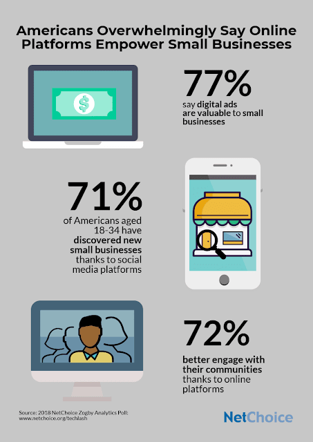
Americans Prefer Ad-Supported Online Services Instead of Paying for Them (Infographic via NetChoice)
Americans overwhelmingly value the contributions of the technology industry and do not support antitrust enforcement, despite aggressive rhetoric from President Trump, a new NetChoice survey of 1,200 U.S. consumers found.
President Trump's draft Executive Order would put tech in the crosshairs of U.S. antitrust authorities. Attorney General Jeff Sessions is also holding a meeting with several State Attorneys General today to discuss accusations of social media bias. 
But Americans don't support an antitrust crack down on America's most innovative businesses.

New polling shows that only about 5% of Americans (on both sides of the political aisles) say the federal government should focus anti-competitive enforcement on the tech industry. 
Further, just 1 in 5 Americans say the break-up of big tech would most benefit consumers.
No Support for Heavy-Handed Government Intervention on Tech Platforms
No Support for Heavy-Handed Government Intervention on Tech Platforms (Infographic via NetChoice)
The value of tech to consumers and businesses is clear.
Over 70% of Americans say that digital advertising platforms like Google and Facebook are valuable to both small businesses and the national economy. 
Just 13% say that they have had a negative experience with large Internet platforms and 72% say that services like Facebook, Google, and Amazon make it easier for them to connect with people in their community.
Consumers Are Empowered with Social Media Choices
Consumers Are Empowered with Social Media Choices (Infographic via NetChoice)
"President Trump's fixation on breaking up tech platforms lacks support from Americans," said Steve DelBianco, president of NetChoice. "Antitrust policy needs to be guided by facts, not emotional outbursts. The government cannot violate the First Amendment by forcing Internet platforms to suppress negative news. Internet platforms are a boon for American consumers, businesses, and, in turn, the U.S. economy. The President should listen to regular Americans and allow U.S. tech companies to continue to thrive and innovate."
Americans Believe Online Platforms Empower Business Advertising and Community Engagement
Americans Believe Online Platforms Empower Business Advertising and Community Engagement (Infographic via NetChoice)

About the Survey:
From August 6-8, 2018 Zogby Analytics conducted an interactive survey of 1,222 adults focused on consumer attitudes toward Internet platforms and government regulation. 
The survey, commissioned by NetChoice, has a margin of error of +/- 2.8%.  It is available at NetChoice.org/TechlashPoll
SOURCE: NetChoice

28 October 2017

Pew Applauds Agreement to Protect Migratory Sharks

by
Shark
Shark (PRNewsfoto/The Pew Charitable Trusts)
The Pew Charitable Trusts today praised the 124 governments of the U.N. Convention on the Conservation of Migratory Species of Wild Animals (CMS) for taking action toward protecting six shark species. The decision came at the end of the weeklong 12th Conference of the Parties (CoP12) in Manila.

The governments of Honduras, Israel, Mauritania, Monaco, the Philippines, Samoa, Senegal, Sri Lanka, and Togo proposed six species—whale sharks, angel sharks, white-spotted wedgefish, common guitarfish, dusky sharks, and blue sharks – for protection through addition to the CMS lists, known as appendices. Appendix I prohibits the catch of any of these endangered species from any place they migrate, and Appendix II identifies the shark species most in need of conservation action, encouraging cooperation to properly manage and protect the species throughout their migratory range.

Today's actions placed whale sharks, angel sharks, and common guitarfish in the Mediterranean on Appendix I and dusky, angel and blue sharks, white-spotted wedgefish, and common guitarfish globally on Appendix II.

KerriLynn Miller, a conservation expert on Pew's shark conservation project, issued the following statement:

"The momentum for protecting sharks continues to build, thanks to the significant step CMS members have taken toward better management of six at-risk shark species.

These species, like many others, are migratory, even those that spend part of their lives in protected waters, leaving them vulnerable to various types of fishing gear. In some regions, the newly protected shark species have experienced population declines of 50 percent or more. The commitment that CMS parties will work together to offer these sharks the help they need to recover is critical to their depleted populations, and is important for making the entire ocean safer for the species that migrate.

The CMS Appendix II listings allow for the sustainable fishing of sharks, but if management measures are not effectively implemented, species listed in Appendix II could qualify for the stricter protections of Appendix I. To ensure that these Appendix II listings have the needed impact, governments must follow through on their commitments to cooperate by developing stronger domestic shark protections, while considering international management through regional fisheries bodies and the Convention on International Trade in Endangered Species of Wild Fauna and Flora.

As for the species that were protected today, the CMS parties have shown that proper management for imperiled sharks and rays continues to be a global priority. We applaud governments for offering the highest level of protection for the whale and angel sharks and the common guitarfish in the Mediterranean, where urgent action is needed, and are encouraged to see additional species—blue and dusky sharks, white-spotted wedgefish, and common guitarfish globally—afforded an opportunity to recover before their populations require full protection. This is an important step toward safeguarding shark populations for generations to come."
  • More information on Pew's global shark conservation campaign is available at www.pewsharks.org.


SOURCE: The Pew Charitable Trusts

Bonus Video:

Bonus Infographic:
How Illegal Fishing Threatens the Safety of Crews - Infographic
How Illegal Fishing Threatens the Safety of Crews

27 March 2016

Holy Infographic, Batman! - Wayne Manor Vs Fortress of Solitude

by

For decades (since they both first appeared in comics, really), people have been debating over who is better, Batman or Superman... 

Today's (quite funny and full of interesting info) infographic is taking the debate to a brand new level by asking "who has the best home?"

Our friends at Cast Iron Radiators 4u have put themselves into the mind of a realtor in the DC Comics universe to try and figure out which of these two giants of the comic book world has the coolest bachelor pad. 


To do this they’ve looked at the history of the Fortress of Solitude and Wayne Manor (and the Batcave, obviously) to see which has the most impressive features, the best location, and the most potential for the non-superhero buyer.

Enjoy...

Loup Dargent


Batman's Manor (and Batcave) Vs Superman's Fortress of Solitude

The Infographic
Wayne Manor vs Fortress of Solitude by Cast Iron Radiators 4u

19 March 2016

UK: Chris Evans vs Jeremy Clarkson - The Infographic

by

Today's infographic compares Chris Evans with Jeremy Clakson, the man he is set to replace as presenter of Top Gear...

Here is what the guys at CarLeasingMadeSimple.com (where we got the infographic from) say about it:

Picking a replacement for Jeremy Clarkson was never going to be an easy task, but you can understand why the BBC plumped for Chris Evans. He's a petrol-head with a long history of hosting big shows but who still has that all important air of irreverence about him. That hasn't stopped the Top Gear community getting nervous about the direction in which Chris will take the show. To help allay this trepidation we've put together this piece comparing Chris with the man he is set to replace. Obviously we're checking up on their love of cars, but almost as importantly we're taking a look at their disciplinary records and how their TV careers compare. 
(Oh, and, by the way, the infographic also includes a quick quiz to see if we can tell our Evans from our Clarkson... Just in case.)

Enjoy...

Loup Dargent

The Infographic
Chris Evans vs Jeremy Clarkson
Chris Evans vs Jeremy Clarkson by carleasingmadesimple.com

26 January 2016

The Evolution Of The Batmobile [Infographic]

by
Holy Batmobile's History, Batman!

Today's amazing infographic (courtesy of the team at BookMyGarage.com) details the history of the Caped Crusader's iconic car from its earliest incarnation to the very latest version...
Surprisingly enough, it was not until the 1966 TV series that the first real Batmobile appeared. (In the 1930s and early 40s Batman’s car was just a bulk standard red convertible with elongated wings and a bat emblem on the front.)


The 1966s TV series' Batmobile was actually a converted Ford Lincoln Futura, which was a concept car that never made onto the forecourt. But, it only took three weeks for the car to be transformed into a vehicle that was fit for a mysterious masked crime fighter.


Since then, the Batmobile has evolved and been brought up to date many times to appeal to each new generation.

Enjoy!


Loup Dargent


The Evolution of the Batmobile by Book my Garage


About Today's Infographic:
The Evolution of the Batmobile by BookMyGarage 

23 January 2016

US: Calling All Marylanders! Take Back Your Summer by Supporting a Post-Labor Day School Start

by
This full page ad will run in select Maryland Publications over the course of the next week.
(PRNewsFoto/Marylanders for a Longer Summer)


Click on image to see it in all its glory.

Marylanders for a Longer Summer is launching a new campaign for Maryland residents to reclaim their summer vacations by supporting a post-Labor Day start to the school year.

The campaign will feature full page ads that will run during the next week in Maryland publications, including: The Washington Post, The Capital Gazette, Baltimore Sun, Carroll County Times, Cumberland Times-News, Easton Star Democrat, Frederick News-Post, Hagerstown Herald-Mail and Salisbury Daily Times.

14 March 2015

Ten Classic Superhero Vehicles [Infographic]

by
 

Yes, I know... It does look like our infographics section has been rather neglected during this last few months. But, fear not! We have quite a few superhero related infographics for you to enjoy coming this way pretty soon. Honest! 

We're starting the ball rolling with a nifty one (created by the peeps at Cherished Number Plates) that takes a look at some of the less common classic superhero vehicles. 

This infographic not only features The Punisher's Battle Van and The Flash's rather unusual Cosmic Treadmill, but also... wait for it... yep... Wonder Woman's Invisible Plane! (Well, kind of...)

Enjoy!

Loup Dargent 

7 October 2014

Fictional Computers - Good Vs. Evil [Infographic]

by

There are so many cool supercomputers, whether in books or movies...

The Team at 'Glow New Media' decided that it would be interesting to take a look at the good and the bad and... made a brilliant infographic about it.

Which side would you bet on?

Enjoy!

Loup Dargent

13 July 2014

Game of Clients - "If Life With Clients Were Like Game of Thrones…" [Infographic]

by

As a (recently converted) Game of Thrones fan, I thought I was in heavens when I found that brilliant infographic made by Infographic World. (I can be a cool Dad once again in my son's eyes... Results! )
"With this awesome Game of Thrones season at an end, we decided to create a playful infographic in a similar theme called Game of Clients. Every design agency on the planet can likely relate to at least one of these."
On the planet only?! I think it's pretty safe to say every design agency in the universe can relate to at least one of these... 

Anyway... Enjoy!

Loup Dargent

30 June 2014

Does Technology Affect Sleep? [Infographic]

by

If you are (or know) someone like me who spends quite a lot of time online, you'll probably answer yes to that question as, unfortunately, there are only 24 hours in a day and, to be able to do "what needs to be done on the net", a rather big slice of our needed sleeping time usually does tend to get sacrificed in the process.

But, through today's infographic, we have the opportunity to explore the relationship between modern technology and sleep disturbances and find out out that our sleep is not just affected by our online habits... Television, video games and mobile phones can be as much guilty as our trusty PC or laptop. Oooh Yes, they are!

On the plus side, this infographic also shows us what we can do to achieve a better night’s sleep. So, don't panic! There is no need to throw our beloved game console/TV set/PC/laptop/mobile phone/etc... out of the window yet

Enjoy!

Loup Dargent

29 April 2014

11 Facts About Anti-Muslim Prejudice You May Or Not Know [Infographic]

by

Today's infographic is an informative and interesting one about anti-Muslim prejudice that we've found on TellMaMaUK.org website (many thanks to the TellMaMaUk Team for kindly letting us re-publishing it). 

This is the second infographic from TellMaMaUK we've published on here (the first one being on the categories of anti-Muslim hate deniers) and, we have had, time to time, the pleasure to also publish statements from them on some of ours racism/anti-Muslim related posts. So, as you can see, the TellMaMaUK Team are no strangers to us...

Featured in today's infographic are:

  • Pavlo Lapshyn 
  • The West Midlands terrorist 
  • The doyens of the ‘Counter-Jihad’ anti-Muslim business which yields them millions of dollars in campaigning funds, Pamela Geller and Robert Spencer.

Stay safe!


Loup Dargent

30 March 2014

How Facebook, Google And Twitter Sell You [Infographic]

by
"With free online services, you’re the product."

As we all know, there is no such thing as a free lunch. And Social media is no exception. 
While Google, Twitter and Facebook are, in theory, free to use, we do pay a price when making use of those free services... See how they make money out of us in today's infographic made by BizBrain.org 

15 March 2014

How Much Does It Cost to Eat Around the World? Find Out In This Interactive Map!

by

One of the deciding factors for many people when choosing where to go on holiday is the cost of leisure activities such as sports, shopping, drinking, and eating. While this guide won’t tell you where the best place to shop until you drop is, it will show you the average cost of eating out in more than forty different countries, for three different types of meals: fast food, a local budget restaurant, and a 3 course mid-range meal for two.

What’s more, we’ll tell you the average cost of a local beer in a restaurant (as little as £0.50 in Madagascar, and up to a massive £8 in Norway), as well as a few need-to-know tips on eating out (such as that in Peru, many small restaurants offer a 3 course lunch, and a drink, for about £3), and facts on the dining customs in each location (like how in Taiwan, you shouldn’t stand chopsticks upright in a bowl).

Want to start exploring? Just move your mouse over the map below – have fun!


7 March 2014

A Slave to the Almighty Dollar [Infographic]

by

Slavery reflects one of the most traumatic times in the history of this nation. Beginning in 1619 with the introduction of the first “indentured servants” to the United States from Africa, this era marked the first time that people were viewed as commodities that could abused and manipulated in the name of profits. By 1660, the practice had become officially institutionalized and recognized around the nation. The first records of slaves on plantations in Barbados and Jamaica appeared by the 1750's. In America, the 1840's saw the publication of pre-made accounting books designed specifically for plantation owners. These ledgers were designed so that owners could maximize the profits they could gain from “human capital” by tracking individual productivity closely. By the time 1860 rolled around, 12.5 million African slaves had been shipped to America using 35,000 separate voyages.

We may think that these days are now a mere dark shadow of the past. However, slavery is still alive and well around the world in many different ways. Sex trafficking, bonded labor, child slavery, and arranged marriages are major problems all across the globe. There is little that is being done to discourage these practices, and over 20 million men, women, and children fall into slavery each and every year. People are still being viewed as commodities. Citizens of the United States may feel that the home of the free exists without such practices being widely used. However, slavery still exists on our shores in much subtler ways.

The corporate environment and modern business practices have many similarities to the techniques exercised by slave owners of the past. People working in the corporate landscape still view their workers as resources that are tracked just as closely as slaves once were. It is still a common saying that everyone has their price, and anyone can be bought and sold for the right amount. Business managers also push their employees to the absolute breaking point in the name of profit for little or no extra rewards. People are mere numbers in this world and viewed as gears in the larger machine. This view is astoundingly close to the philosophies that once guided plantation owners who used slavery as their means for production.

24 February 2014

How Google is Actually Changing Education [Infographic]

by


“Education lies at the very core of our company’s mission, to organize the world’s information and make it universally accessible and useful.” — Page and Brin
To be honest, before I published this post, when someone mentioned Google, I always thought of the company's presence on the internet but very rarely of its impact on education... A mistake that is now duly rectified (and that I'll definitely never make again), thanks to this neat infographic from TopMastersinEducation.com.

Enjoy!

Loup Dargent

18 February 2014

The Six Categories Of Anti-Muslim Hate Deniers [Infographic]

by

Today, we're very happy to share with you guys this fun infographic/comic strip, where the anti-Muslims deniers have been categorised in a humoristic way, compliments of our friends at TellMaMa.UK.

"Meet the (i) aggressive denier (ii) the mosque building denier (iii) the passive aggressive denier (iv) the ‘laissez-faire’ denier (v) the peaceful co-existence denier and (vi) the ‘head in the sand’ deniers." 
I couldn't but notice that some of the Far Right peeps that I usually "meet" on Twitter seem to belong to more than one category... Perhaps I should ask them which category they believe they are in? Hmm... on second thought, better not. Last time I made fun of them, I got mass reported by the humorless morons and got my account suspended for almost an hour. (They're a touchy lot those Islamophobes, aren't they?)

Anyway, enjoy!


Loup Dargent

25 January 2014

The History of Germs [Infographic]

by

Essentially, bacteria was the first type of life to form on planet Earth, which is why advancing in technology to help understand bacteria and germs is so important today. Germs have technically been around for more than 3,500 million years, and were only first recognized in the 1670s, when Atnon van Leeuwenhoek first began looking at different microorganisms underneath a microscope. Understanding germs and bacteria today allows us to move forward with vaccines, cures and medicine to boost our immune systems and to increase our overall lifespan.

Types of Germs
There are four types of germs that are categorized individually. Bacteria is considered single-cell creatures, which often require a microscope to view. Bacteria lurks just about everywhere on the planet, ranging from the air, water, soil and even on the human body. It is possible to find bacteria on nearly all surfaces and spaces of the earth with a microscope.

A virus is another type of germ which requires a host to survive and continue on. Viruses are capable of reproducing and growing on their own with the right host and amount of food. Viruses live within a the actual cell of an animal, human being or even a living plant.

Fungi is another type of germ that lives off of plants and animals. It is made up of a number of cells. Additionally, protozoa is the final type of germ, which is extraordinary small, similar to bacteria itself. There are more than 20,000 different types of protozoa known to man today. Protozoa can be found in ponds, rivers, lakes, oceans and any type of body of water.

Deadliest Germs
Some of the deadliest germs still exist on earth today, which is why hygiene and being proactive with your health is essential to avoid them. E Coli is one of the most deadliest germs that is found just about everywhere. It is pathogens that trigger deadly diseases and illnesses in humans, which can ultimately be fatal.

Salmonella is another deadly germ that has the ability to take two forms. One of the forms of salmonella, typhi, triggers thypoid fever in its human host, responsible for more than 216,000 deaths a year.

Tetanus is another deadly germ which is dirt carrying spores which can lead to sickness and is potentially fatal. Streptococcus is another germ that is responsible for a large number of deaths due to pneumonia and meningitis.

You Might Also Like